NO ESCAPE!

NO ESCAPE!

Friday, May 20, 2011

back to painting...

Whilst I have spent a lot of time on the pinhole camera over the last 2 weeks or so I have also tried to keep my hand in on painting....as this is what I am supposed to be doing. Therefore over the last couple of weeks I have continued to explore large format mark making. Experimental sessions led by Sylvia and Phillipa led to trying out scraping of paint from a coated surface while the admired work of John Virtue has led to 2 attempts at building definitions inspired by the different vanatage point of the pinhole work.

St Johns Cathedral ~ 1.7 metres x 1m


A childs eye view of a dark foreboding church against a dark ominous sky. Overtones of fear inferred by teh sharp railings pointing up to the same vanishing point as the steeple. One railing drawn out of alignment wrt the others to suggest something is wrong ......Would love to tackle some serious issues of the day such as clerical child abuse and need to keep this in mind as my insight develops over teh coming weeks,months,years.

A later attempt at mark making using teh same subject is as follows...20 mins work pushing paint around a pva treated paper surface before it dries in and becomes unworkable.


Only partially successful and need to learn how to do cloudy skies more realistically.

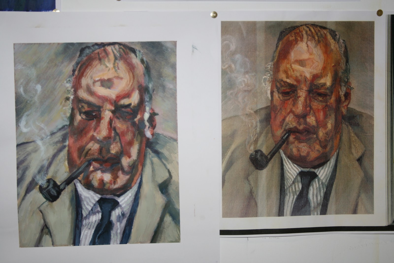
Further attempt with old man image turned out a little better....


Particularly happy with definition of lips,hair and general sombre tone. This aligns well with my pretty painting of the disused Georgian building...fronted by scaffolding. The commonality of both objects ignored and left alone, untended...waiting to die. Will try and place these together in the corner of exhibit to show linkage.


Like the OLD MAN - forgotten , ignored, waiting to die!

last few images

Composition including glass,mirror , magnifying glass etc against a black back drop. (in this case a dunnes stores shopping bag)


Glass surfaces catch light magnificently and reflection in mirror shows the camera itself as described in previous post. Enlargement of mirror frame due to magnifying glass is clear and the image is generally interesting to examine and decipher which a positive image would be  to a lesser degree.

Looking at the seeing things from a new perspective angle, which is the strengthy of this type of photography I used the camera in 2 more unusual spots to catch views you would normally ignore.

More successfully this glance along the centre of the bike rack in the back courtyard seems unworldly. When the image is placed back to back with a copy the similarity to an old celtic design is striking.

 The pair together....can be seen another time due to server problems.

View of Georgian disused buildings/disgrace in the middle of Limerick city centre.


Again , very large depth of focus adds interest to this view which would otherwise be out of focus and more distorted due to state of the art camera lenses.

what does pinhole camera look like and how do I make one.

A closer look at the pinhole camera


Pinhole Camera was created by simply cutting a large hole (~1cm diameter) in the lid of a black cardboard box. A pinhole is formed by poking a needle thru a thin strip of tin cut from an old coke can and attached to the cardboard box over the centre of the hole. Another strip of metal is used to act as a shutter to admit or prevent light to the box. This is attached by a piece of tape and manually opened and shut using some sort of adhesive tape.

1) Load photopaper into bottom of box and tape in safelight , darkroom conditions. (red light)
2) close box and tape down shutter to maintain true dark inside box.
3) go to subject and secure camera in a stable spot not liable to small movements due to wind, vibration from machines, passing people etc etc
4) remove shutter and expose paper to light coming thru pinhole.
5) after allocated exposure time / mins/hrs/days depending on lighting conditions and diameter of pinhole, reattach shutter.
6) return to darkroom and remove paper from box under safe-light conditions.
7) place paper in developer tray for 5 mins
8) transfer to stop bath for 2-5 mins
9) finally transfer to fixer bath for 15 mins prior to rinsing in water and drying paper in dedicated machine.

If you've fucked up anywhere along the way .....start again!

Numerous excellent websites can advise you on the ease and flexibility of pinhole camera work.


final ranking contd

Interesting shots of the largely unoccupied gallery as viewed from about 10 feet of the ground looking towards the chapel direction. The curved ceiling and arches complement the straight vanishing lines into the distance and the strong vertical lines of the unmanned easels. Being asymmetrical wrt room where the near wall disappears into the distance at a grazing angle is a nice contrast to the gentle more expansive information from the far wall.


The above image used a convex paper bend to compress the image towards the centre. The next image shows the uncompressed image produced on a 'flat' paper surface. It still works well but maybe loses a little impact.


EXPLORATION with addition of other traits...other than photoshop originated...

1) Printing thru cling film. ie stretching a thin sheet of crumpled cling film on top of the paper such that the light from the pinhole passes through the cling film before striking the paper. This worked reasonably well on images with lots of intermittent tone in that the cling film has no effect on bright white or dark areas.....ie high contrast images show little effect.


Cling film has been placed over the paper on the left hand-side of the image. The resultant ghostly effect may be appropriate for some images in the future as it does work remarakably well with mid-tone areas.

Though somewhat underexposed the following image shows that distinct highlights....(very little light penetration) can be created using the random folds of the cling film.


Attempts were made to develop the image in small puddles of developer bubble sprayed onto the paper....
This effect can be seen , but is really not that interesting to these subjects and there is the distinct problem of not knowing where the image is to apply this technique to key areas. Could be done though if was deemed crucial....takes planning.

Psychaedelic bubble type effect seen in dark to some degree but easily visible in mid-tone areas.

further pinhole work

A few more outdoor shots were taken using the heavier wooden box , smaller format, (~ 10cm x 15cm) as opposed to full 20 x 25cm of home-made device.
View from the back of the humt museum. 5 mins exposure time in strong sunlight. Blurring of boat in foreground is due to slow drifting back and forth in the water. Long exposure time eliminated short term appearances but only blurs very slow moving objects.


Negative and positive views of St Johns Cathedral taken from close to the foot. Again the remarakable depth of focus is clear to see.
Cool composition using the curve of the bannisters in the foreground to lead into the view of the car park in the midground and the park and trees in the background. The white tree foliage against the black sky is particularly striking. I think these images to train the eye as to what is important for image forming in terms of capturing the eye and interest of the viewer.


painting ranking - the story continues

Growing success with pinhole photography as skills in exposure time / aiming of camera and composition continue to improve. Inhibeited by the poor weather conditions most shots are indoors but I feel I have taken advantage of the pinhole camera's very large depth of focus which keeps everything in focus. This is in sharp contrast to a std high sepped exposure normal camera view where only the foreground or the background are in sharp focus....but not both. In many ways this is how our brains work in that it focusses on what is important at the time but does not process all of the information sent from the eyes.

It could be argued that pinhole or at least very small aperture (large depth of field) is a way of looking at our surropundings in a new more comprehensive way than is the norm.


Wooden Box camera - outdoors - 10 mins exposure.
As is often the case the negative raw image is more interesting than the resultant positive from post processing via photoshop. One can create positives by exposing a new sheet of paper thru the inverted negative paper image , but this is not very advantageous and I personally think negative is 'generally' more interesting causing you to stop and stare automatically to try and work out what is what. As well as being negative in terms of black and white the left to right swap can be confusing but in these examples remains uncorrected, largely thru laziness and reluctance to go for true repreesntation.


This is one of the initial successes. Strong light thru skylight dominates overhead but the clock and flasks on the wall are resolved reasonably clearly. This was taken as the initial subject on a cold windy day to evaluate the possible distortions of images via the photo paper bending...accepting the data from the pinhole.


This distortion , curvature of normal rectilinear 'flat' definition was acheived using convex paper bending with paper bent closest to the pinhole in the centre.

The convers 'concave' bending results in the following equivalent.


Again , in my opinion the 'negatives' from a more interesting view than the positives shown below.

NOTE - There is 'hairiness' of the edges of the image. This turned out to be the feathering of the carboard in the hole formed to take the pinhole formed in the small sheet of flattened tin. (piece cut from empty coke can).
This issue was resolved in later images by trimming back the edge of the cardboard further from teh active pinhole. (surprisingly long way ...but the pinhole does have a very wide angle view of the world).


Sunday, May 15, 2011

ranking project - painting continued

Spent a lot of time looking into pinhole camera images and what they bring to the party wrt to standard camera based images and maybe how these differences could be used to inspire interesting views of objects.

Saw some work on the web in New York covering the key differences , in my opinion.

Use of pinhole cameras , gives the user almsot infinite depth of focus at the general cost of  significantly longer exposure times. (maybe not a 'cost or restriction' for many purposes. With a photographic paper 'negative' easy distortion of the resultant images is acheived by curving the receiving paper surface.


This exposure from Micheal Wesley shows the old MOMA building being demolished and the new one being built over an exposure time of some 34 months. Of course the proportional time of the completed new building and the rapidly demolished old building would be small and the overal sense is of change about a rigid skeleton due to fundamental beams / foundations of the building.

The easy manipulation of images , without photoshop can be shown in the following image from Michel Baryard of the Brooklyn Bridge, New york.


OK. So looks like fun. Built a simple camera from an old jigsaw box, capable of taking 8 x 10" photo paper before I discovered the availability of a custom-made wooden box from the photography dept.
Took a couple of days mesing around to get the feel for the exposure times and directionality, do's and dont's ...but ended up with some interesting images.


Wednesday, April 13, 2011

closure of ranking project (painting)

Its only now that I fully realise the the procedure to follow in construction of a painting.

1) research in terms of what has been done by other artists with your subject/proposed style of rendition.
2) thumbnails to look at a list of alternatives
3) more detailde exceution looking at possible materials/types of mark making ..that work best.
4) Finally execution without any big surprises.

In the heat of the moment some of these steps were omitted or at least the order changed as the 'heat' intensity increases and the underlying need to be finishing something demands to be satisfied.

Anyway...... started with the college.....gave up on it for a few days due to poor weather/kwik drying acrylic paint....dabbled with protraiture...and then was refocussed back outside in the wind and rain....for the big ones.

Lots of new marks, big scale changes marks required over and above just making everything bigger...and learnt a lot of what not to do...at the very least.
Inspiration from John Virtues atmospheric B&W London scenes ...all moody and magnificently bordering on the abstract. Initial attempt at this technique had admittedly poor composition but some success in having fun and getting the feel of big painting.

This is what happened....

Avenue of trees at the front of the college.....~ 2metres high

In the same vein ...a view looking at the college from the front wall.


This canvas has a 'Virtue esque' attempt on the back....which bled thru to the front to a positive effect. It was hard work ...but eventually just about worth the effort. Even though mistakes were made ...many of them added character to the piece...no matter how blatant the error ...and that this sort of scale ...creates an environement where you must let go/ have fun and see what happens.....as well as meticulous planning upo front...of course.

Other stuff produced over the last few days were .....

hmmm...!


what happpens next?

Friday, April 1, 2011

ranking project - painting

well!!!  Went for painting and struggling a bit like most others in the class. Contradictions at every step.....chose anything you want....as long as its 5 mins or less from college. Dont use photographs ...though clear use in previous years sketchbook examples. Have fun and relax.....when we are in direct competition with each other, Chose any artist/technique that you like....as long as its on our list of luvvies.
who'd have thought that art college was more judgemental than civilian life? Surprise to me.
Anyway, as I said, trying to steer a path thru troubled waters......
2 images of note so far.....


Grumpy looking eh!!


Avenue of trees leading to small altar ....
Realised in white paint on black card....scratched away to form highlighted black tree at the right of the altar.
Fore ground and trees depicted using a heady mix of crimson, raw umber and blue....with a little white for the grass at the front. Marks made by soaking small wooden canvas stretcher corners which gives the ill-defined broken up structure of the tree trunks and branches.More paint applied to trees at the fron to add to perspective,


Sunday, March 13, 2011

2nd week painting elective

2 tonal paintings ~ 8 hrs each......


and the second masterpiece....

painting elective - news from the front!

After a ropey start grew more and more comfortable with time limitation, acrylics and limited subject matter. Enjoyed the life-painting and the extended tonal paintings during week 2 but didnt have much fun with installation. (not used to even trying to mimic colours exactly...tyoically substitute my own).

Please find attached images of semi successful output.

1st go with palette knife.....


Then there was the 2nd of 2 life-painting attempts... tricky angle....


Then at the weekend we had to copy a painting from Freud or Vermeer. I chose 'old man smoking' by lucien freud and apart from some dodgy colours here and there am very happy with tthe result and the challenge in doing it.

2nd week next post

Sunday, February 27, 2011

graphics week 2 contd

Am currently reading lateral thinking by Edward de Bono which I find very very interesting after an extensive career trying to find patterns in the performance of silicon chip manufacturing. The 'extra' paths to solutions for any given problem is the desired outcome and with a bit of practice/training/reading these beneficial additions should be availbe to anyone.
Anyway, back to last week. My 3rd proposed solution to the 'above' illustration is a pair of eyes staring upwards. This started off as a group of people loking upwards ...but was simplified from a group to 2 people , to a single person, to a photo of a pair of eyes and finally to a graphical representation of 2 eyes with pupils placed above the equeator to imply looking up. The white area represents nothing (ie above) while the black surround provides distinct boundary conditions without implying anything else going on. (other way around might have implied space or darkness) Anyway, I think solution works.

So, thats it for viscom....for the moment anyway. really enjoyed doing the work once got past the mental block at the beginning. As I said, lateral thinking is a technique that can be learnt or at least improved upon ...and I think a better understanding of the boundaries will make things go better next time around.
Painting next !!! 

Thursday, February 24, 2011

week 2 graphics

describing the word above with illustration only.....
3 options pursued after initial brainstorm filtering and rejection.

This is a view of part of the studio ceiling covered in the footprints of 'army boots'.
This follows on from the Marxist / suppression theme launched in the 1st week in the jackboot solution.
Apart from looking up and implying the word above... the supremacy of the power that controls the army is implied. To strengthen this image there is also the FIST symbol often identified with extreme socilaism or marxism somewhat hidden or at least secreted in the pattern on the sole.
see close up next .... (bunch of soldiers standing to attention reinforces army idea)


next up is the man almost submereged by debt and misery due to recent financial crash ...barely keeping his head above water.


He doesnt look well and I think unfortunately reflects big chunks of society.
More later ....

Wednesday, February 23, 2011

VISCOM ELECTIVE - ABOVE

My target word is 'above'
Week 1 ...illustrate the meaning of the word by using typography alone.
Found this very tricky and took a couple of days to get into the project and realise fully what was allowed and what wasnt.


1st example....... ABOVE?  
premise - ABOVE means nothing in space where there is no up or down and therefore no higher or lower....
Letters are floating in space in a true 3D sense with the letter O substituting for the sun or some other heavenly object. The typeface is consolas being unfussy and modern with the 3D depth on all other letters to reaffirm the fact that the O is different from the other letters. The addition of some stars in the background was pushing it a bit.


'Above ' the madness of everyday life....
Cool blue wave -like transcendental 'above'....floating elegantly above the chaos of texts,directions and colours of the masses below.


In the last of 3 submissions a jackboot was formed using the letters written and manipulated interms of height , distance above the x-axis and depth into the page. The red glow was used to hint at marxism and infer the forces of suppression of individual freedoms. The crowd below is made up of the word above in small text written many times upside down to create the resemblane to vast multitudes.
Shadow should have been done in the same manner but was added through semi-transparent shape with a linear gradient.

Overall, pretty happy though found this word difficult typographically as it is by definition a term relative to something else. If you cannot spell or show ...something else....then .....I for one struggle a bit.
Next week ...illustrative version of the same.

2 weeks elective on ceramics

Retrospective images from 2 weeks elective in ceramics.
Tutors - Elaine and Kieran.
Design , manufacture and preparation of varoius ceramic pieces through the relatively quick and simple Raku firing process.

The 'theatrical' display of finished pieces. really enjoyed this 2 week blast being very interested in the process itself, what you can and cannot do with clay mechanically and of course the aesthetics.
More pics below.


and yet more....


Its taking a long time to download images so I'll leave it at that just now.
In summary -
Loved the degree of randomness that raku offers ...which always seems to look right in the arrangement of spots and cracks acros or wonderful designs. I reckon this is probably due to the natural stresses and strains in the material / design resulting in a harmonious outcome. Similar to printing you never get quite what you expected and yet this tends to be a positive for the above reason.
Loved the time in the classroom and in the workshop and very interested in kilns ,temperatures and response of the clay.......Could see myself whiling the days away sweating it out doing this kind of stuff....no problem.