NO ESCAPE!

NO ESCAPE!

Friday, April 1, 2011

ranking project - painting

well!!!  Went for painting and struggling a bit like most others in the class. Contradictions at every step.....chose anything you want....as long as its 5 mins or less from college. Dont use photographs ...though clear use in previous years sketchbook examples. Have fun and relax.....when we are in direct competition with each other, Chose any artist/technique that you like....as long as its on our list of luvvies.
who'd have thought that art college was more judgemental than civilian life? Surprise to me.
Anyway, as I said, trying to steer a path thru troubled waters......
2 images of note so far.....


Grumpy looking eh!!


Avenue of trees leading to small altar ....
Realised in white paint on black card....scratched away to form highlighted black tree at the right of the altar.
Fore ground and trees depicted using a heady mix of crimson, raw umber and blue....with a little white for the grass at the front. Marks made by soaking small wooden canvas stretcher corners which gives the ill-defined broken up structure of the tree trunks and branches.More paint applied to trees at the fron to add to perspective,


Sunday, March 13, 2011

2nd week painting elective

2 tonal paintings ~ 8 hrs each......


and the second masterpiece....

painting elective - news from the front!

After a ropey start grew more and more comfortable with time limitation, acrylics and limited subject matter. Enjoyed the life-painting and the extended tonal paintings during week 2 but didnt have much fun with installation. (not used to even trying to mimic colours exactly...tyoically substitute my own).

Please find attached images of semi successful output.

1st go with palette knife.....


Then there was the 2nd of 2 life-painting attempts... tricky angle....


Then at the weekend we had to copy a painting from Freud or Vermeer. I chose 'old man smoking' by lucien freud and apart from some dodgy colours here and there am very happy with tthe result and the challenge in doing it.

2nd week next post

Sunday, February 27, 2011

graphics week 2 contd

Am currently reading lateral thinking by Edward de Bono which I find very very interesting after an extensive career trying to find patterns in the performance of silicon chip manufacturing. The 'extra' paths to solutions for any given problem is the desired outcome and with a bit of practice/training/reading these beneficial additions should be availbe to anyone.
Anyway, back to last week. My 3rd proposed solution to the 'above' illustration is a pair of eyes staring upwards. This started off as a group of people loking upwards ...but was simplified from a group to 2 people , to a single person, to a photo of a pair of eyes and finally to a graphical representation of 2 eyes with pupils placed above the equeator to imply looking up. The white area represents nothing (ie above) while the black surround provides distinct boundary conditions without implying anything else going on. (other way around might have implied space or darkness) Anyway, I think solution works.

So, thats it for viscom....for the moment anyway. really enjoyed doing the work once got past the mental block at the beginning. As I said, lateral thinking is a technique that can be learnt or at least improved upon ...and I think a better understanding of the boundaries will make things go better next time around.
Painting next !!! 

Thursday, February 24, 2011

week 2 graphics

describing the word above with illustration only.....
3 options pursued after initial brainstorm filtering and rejection.

This is a view of part of the studio ceiling covered in the footprints of 'army boots'.
This follows on from the Marxist / suppression theme launched in the 1st week in the jackboot solution.
Apart from looking up and implying the word above... the supremacy of the power that controls the army is implied. To strengthen this image there is also the FIST symbol often identified with extreme socilaism or marxism somewhat hidden or at least secreted in the pattern on the sole.
see close up next .... (bunch of soldiers standing to attention reinforces army idea)


next up is the man almost submereged by debt and misery due to recent financial crash ...barely keeping his head above water.


He doesnt look well and I think unfortunately reflects big chunks of society.
More later ....

Wednesday, February 23, 2011

VISCOM ELECTIVE - ABOVE

My target word is 'above'
Week 1 ...illustrate the meaning of the word by using typography alone.
Found this very tricky and took a couple of days to get into the project and realise fully what was allowed and what wasnt.


1st example....... ABOVE?  
premise - ABOVE means nothing in space where there is no up or down and therefore no higher or lower....
Letters are floating in space in a true 3D sense with the letter O substituting for the sun or some other heavenly object. The typeface is consolas being unfussy and modern with the 3D depth on all other letters to reaffirm the fact that the O is different from the other letters. The addition of some stars in the background was pushing it a bit.


'Above ' the madness of everyday life....
Cool blue wave -like transcendental 'above'....floating elegantly above the chaos of texts,directions and colours of the masses below.


In the last of 3 submissions a jackboot was formed using the letters written and manipulated interms of height , distance above the x-axis and depth into the page. The red glow was used to hint at marxism and infer the forces of suppression of individual freedoms. The crowd below is made up of the word above in small text written many times upside down to create the resemblane to vast multitudes.
Shadow should have been done in the same manner but was added through semi-transparent shape with a linear gradient.

Overall, pretty happy though found this word difficult typographically as it is by definition a term relative to something else. If you cannot spell or show ...something else....then .....I for one struggle a bit.
Next week ...illustrative version of the same.

2 weeks elective on ceramics

Retrospective images from 2 weeks elective in ceramics.
Tutors - Elaine and Kieran.
Design , manufacture and preparation of varoius ceramic pieces through the relatively quick and simple Raku firing process.

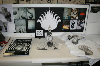
The 'theatrical' display of finished pieces. really enjoyed this 2 week blast being very interested in the process itself, what you can and cannot do with clay mechanically and of course the aesthetics.
More pics below.


and yet more....


Its taking a long time to download images so I'll leave it at that just now.
In summary -
Loved the degree of randomness that raku offers ...which always seems to look right in the arrangement of spots and cracks acros or wonderful designs. I reckon this is probably due to the natural stresses and strains in the material / design resulting in a harmonious outcome. Similar to printing you never get quite what you expected and yet this tends to be a positive for the above reason.
Loved the time in the classroom and in the workshop and very interested in kilns ,temperatures and response of the clay.......Could see myself whiling the days away sweating it out doing this kind of stuff....no problem.